Showcasing Student Life at Cal Poly, San Luis Obispo
Cal Poly—using design to integrate first students into university life.
When California Polytechnic State University, San Luis Obispo, asked us to design a new residential complex for first-year students, we thought strategically about the location: a prominent gateway to the southeast edge of campus, right off Grand Avenue, the main boulevard that leads from Highway 101. The obvious solution would have been to put a large, eye-catching architectural form right up front.
But we decided instead to put the focus on the activities of the students. Too often, student housing complexes are conceived as walled fortresses. We wanted ours to be porous, opening up to the neighborhood and the city as well as the rest of campus.
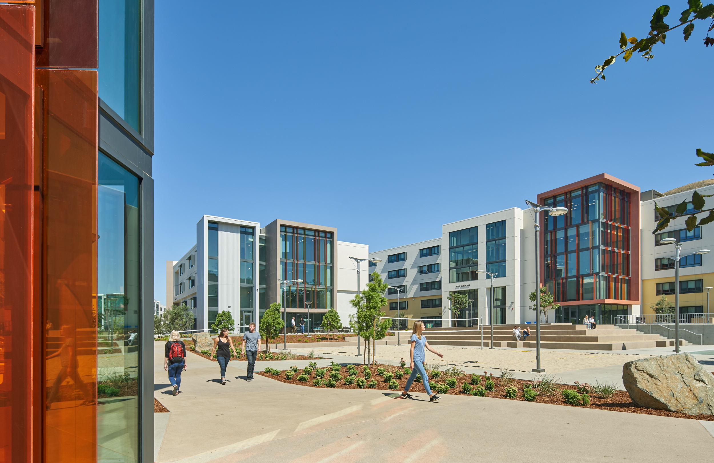
So at the Grand Avenue entrance to campus, we placed a courtyard that has a basketball court, a sand volleyball court, and other activities. We felt that there was nothing symbolized Cal Poly more seeing students at play as people drove up to the campus. Similarly, each building has a major stack of study spaces that open up to Grand Avenue, where people can see students at work.
Photo by Bruce Damonte
Photo by Bruce Damonte
The first building in the complex that you see as you walk in is the Welcome Center, which is where all campus tours originate. This building was not in the original program—the university decided to add it later—but although it meant redesigning the entry sequence, we felt it makes a lot of sense to put it here. As parents and prospective students drive to campus on Highway 101 from San Francisco or Los Angeles, they’re naturally going to arrive here first. So what better place to put the Welcome Center?
From the very beginning of the project, we knew we wanted to create a strong public space at the center. So at the heart of the complex, we created a large courtyard with a lawn. We envisioned this as the space where first-years would hang out and meet friends.
Then we organized the seven buildings of the complex around this space. They’re something of an anomaly in the pastoral, suburban neighborhood. The university is aware that to maintain the historic scale and walkability of the campus while also accommodating growth, it has to add taller infill structures rather than spread out. So the new complex, which ranges from three to five stories tall, is much denser than the rest of campus. It’s right next to mid-century student residences that are only two stories high.
Photo by Bruce Damonte
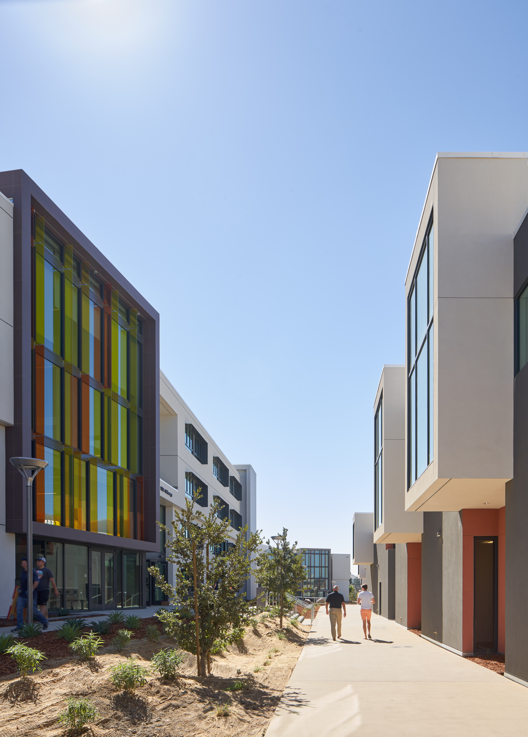
To break up the visual mass of the new buildings, we clustered windows together, which cuts in half the number of perceived openings. L-shaped sunshades shield windows from the top and from one side, carefully placed to mitigate solar heat gain while also giving the facades variety and texture. Across the long facades, which have windows to resident rooms, we offset the façade horizontally to break down the massiveness of the walls.
We were on a relatively strict budget, so we had to manage the architectural “wows.” We focused on creating architectonic forms that would be monumental, clad in stucco, an inexpensive but nobile material. These forms contain the living rooms and study spaces, because we decided that the public spaces should go all the way through the buildings, from the courtyards to the exteriors, expressing the buildings’ functions on the exterior.
On one or two edges of these forms, we invested in expansive glazing, which brings natural light into all public spaces. Views look out over the surrounding campus and the surrounding town of San Luis Obispo. The natural landscape around the campus is beautiful, with mountain ranges in the distance, stands of trees, and a number of natural elements that create an incredible amount of visual interest. So we wanted to focus views to the surrounding landscape. In the evening, these public spaces are lit to reveal themselves and the internal activity to the surrounding areas on both sides of each building.
Photo by Bruce Damonte
Photo by Bruce Damonte
Photo by Bruce Damonte
Universities are all competing to attract the best possible students with great facilities. Making a strong first impression is really important. But flashy buildings aren’t necessarily the right move. By exposing student activity both inside and outside the new student housing complex, we hope to showcase the energy of life at Cal Poly to parents and prospective students, while creating architecture that enhances the first-year experience, helping students form those all-important connections with each other early on. Because when you remember your first year of college, it’s not the buildings you remember so much. It’s the experiences you had in and around them.
Photo by Sadie Rogers, Cal Poly
Author
Joe Valerio, Principal


