A Summer of Design: NeoCon 2022
With this summer’s design events at the Merchandise Mart and the Fulton Market, VDT got the full experience of NeoCon and MillerKnoll Days!
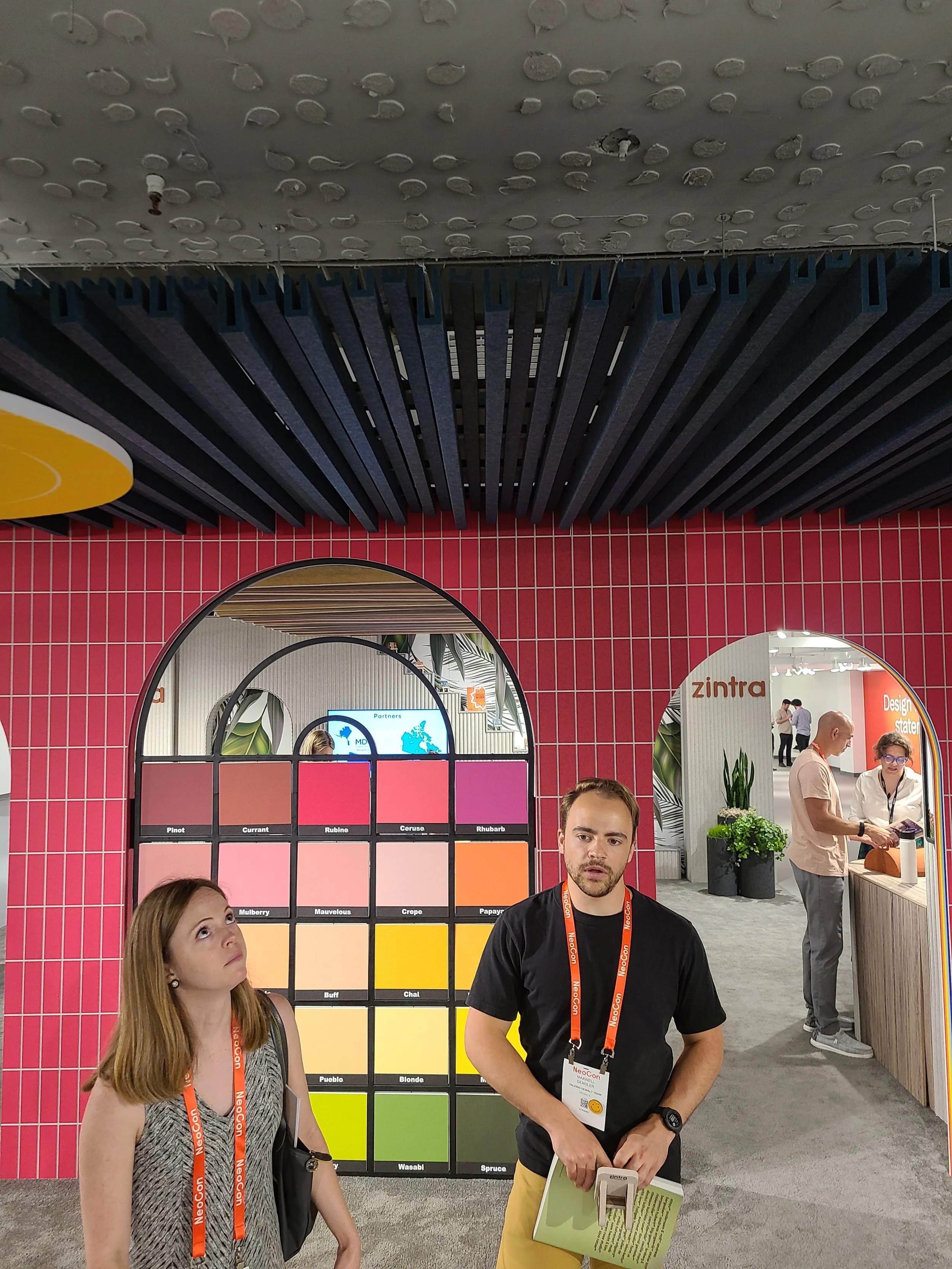
True to NeoCon form, it was nearing 100 degrees in Chicago and we were all freezing inside the Merchandise Mart and Fulton Market attending a spectacular display design showcases. Throw in a couple rooftop parties, a load of great new products, and a tornado and it’s a recipe for a memorable year.
We love getting inspired by the new products, showroom design, and creativity that this design season offers. If you weren’t able to attend this year, check out some of our favorites below!
Modular
Ishita Gupta
Architecture StudioCategory: Modular
Product Name: Bobby
Company: Bernstrand & Borselius for Blå Station by Scandinavian Spaces
WHY ISHITA LOVES IT
Modular furniture had its shining moment at NeoCon this year. With many brands catering to a hybrid workplace post-COVID, the “kit-of-parts” style thrived as both ancillary and desking solutions. Scandinavian Spaces showcased “Bobby” by Bernstrand & Borselius, a flexible and playful ancillary seating system that uses powerful magnets to snap together chairs and ottomans to create sofas and benches, but will shine when used as a single chair as well.
Flooring
Christine McGrath
Architecture & InteriorsCategory: Flooring
Product Name: BottleFloor & Unite II
Company: Shaw
WHY CHRISTINE LOVES IT
Shaw released a number of cool new carpet alternatives for the Workplace. Two that especially caught my eye were the BottleFloor and Unite II.
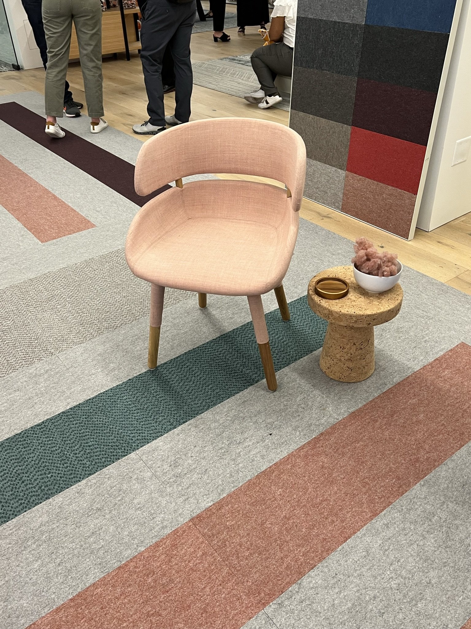
BottleFloor is a hybrid flooring material with the look of a soft surface and the durability of a hard one. Made in the USA, BottleFloor is PVC-free, contains no plasticizers and no chlorine and is 100% recyclable back into itself. Each yard of BottleFloor contains an average of 61 recycled plastic bottles. The colorway is great, and one can choose between both solid and speckled tiles.
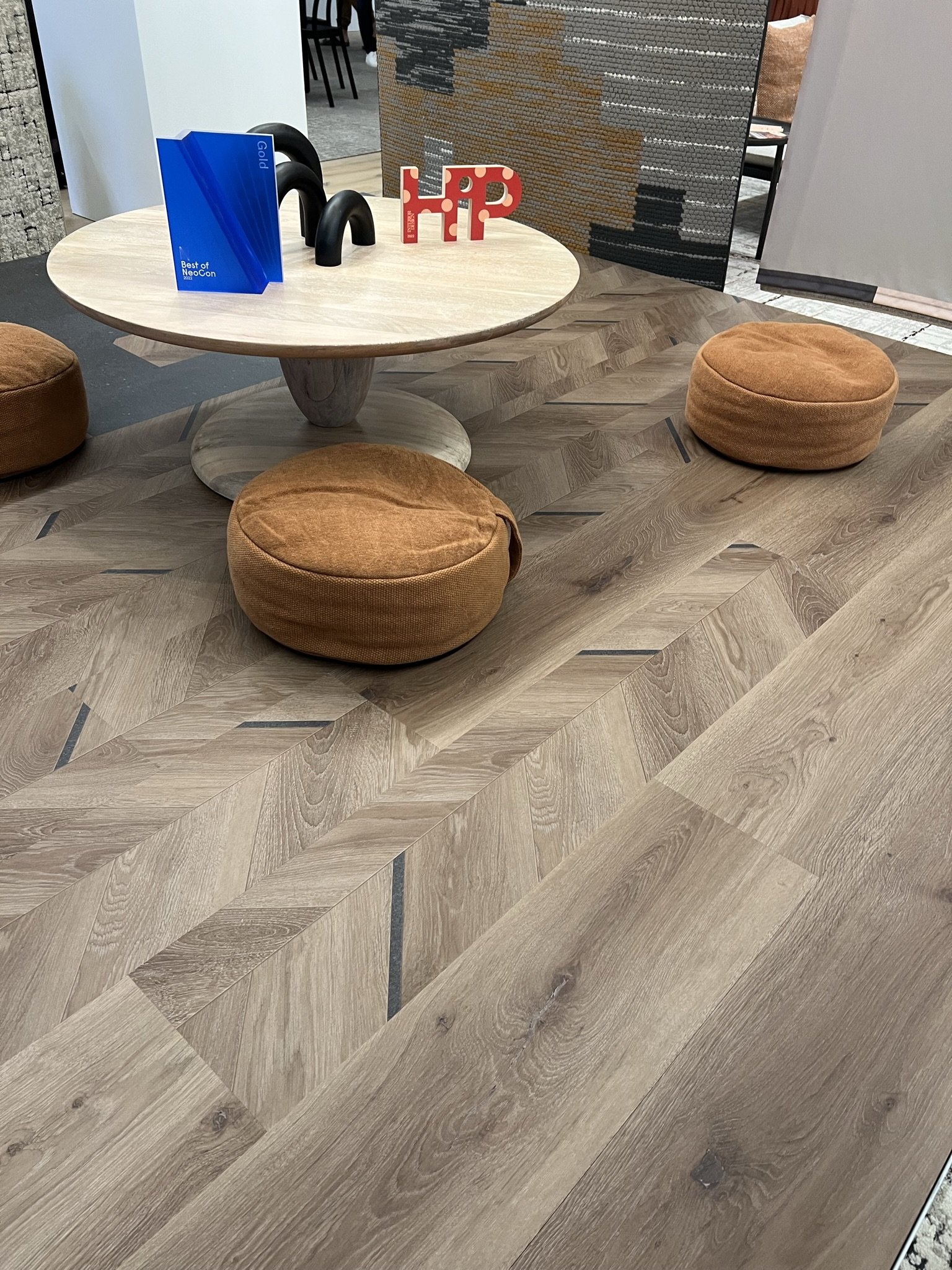
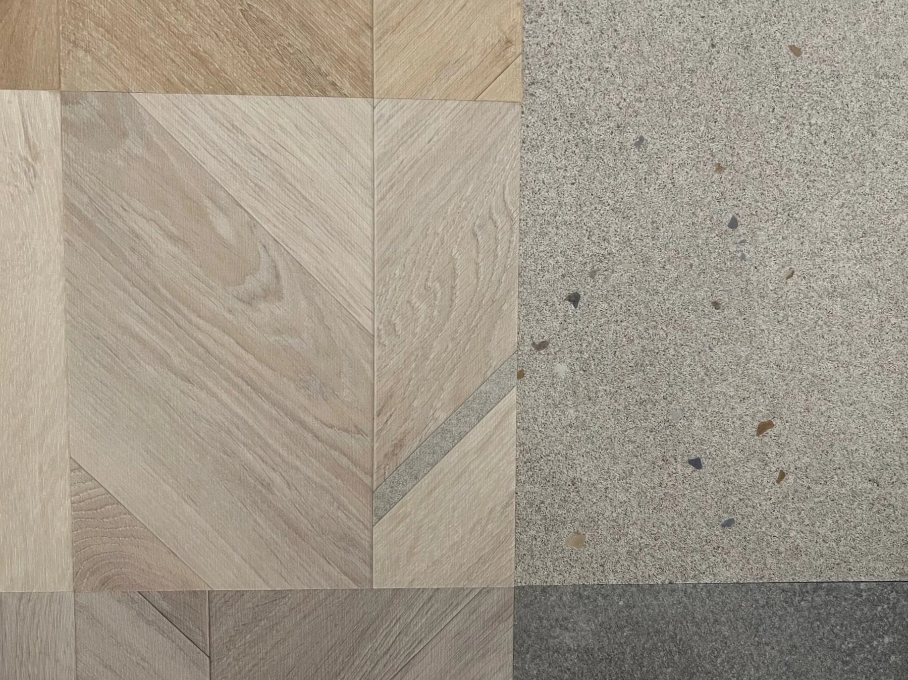
A 2022 Interior Design HiP Award Winner, Unite II is a LVT collection that combines the look of clean wood with insets of a concrete terrazzo visual. The wood tones offered are versatile, modern and fresh. One can mix and match between straight laid and herringbone-style planks in varying widths in a side by side install. The diagonal concrete terrazzo accents in the herringbone planks give the floor great visual activation and small-scale detail.
Workstations
Interiors Studio
Jessie Stone
Interiors StudioCategory: Workstations
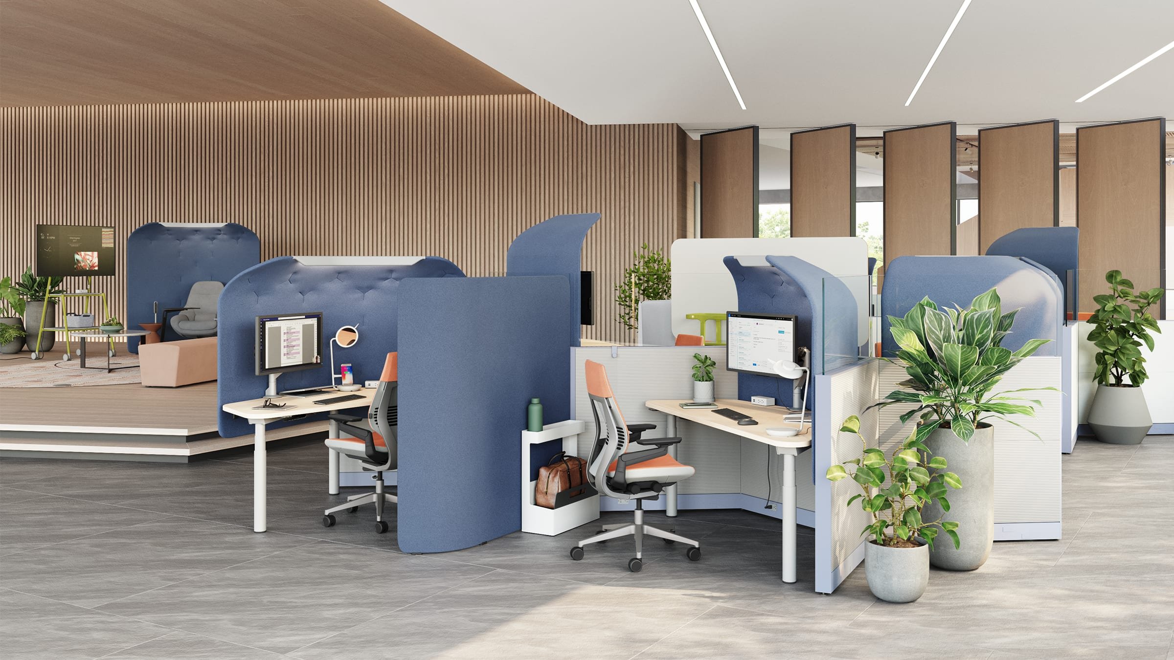
Product Name: Flex Personal Spaces
Company: Steelcase
WHY JESSIE LOVES IT
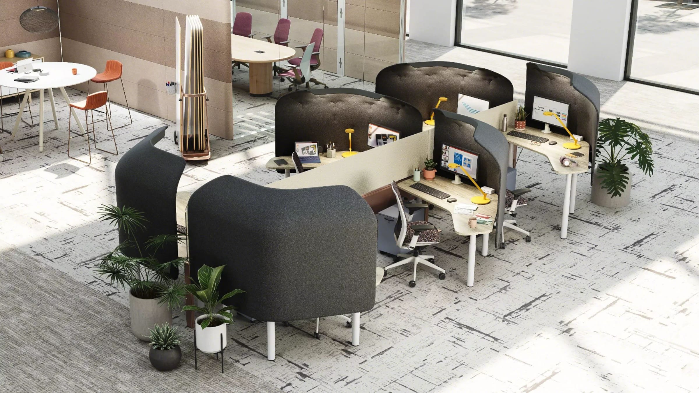
We’ve seen a heightened need for flexibility in the workplace in the last few years - it’s no surprise that Steelcase delivers! The Flex Personal Spaces are modular workstations that give users the ability to adjust their privacy, control, and comfort levels at work by rearranging their work surface and privacy screens to cater to the type of work they’re doing. This idea of the user being in control creates a more flexible and inclusive environment, and I hope to see more companies expand on this.
Ancillary
Rebecca Snow
Interiors StudioCategory: Ancillary
Product Name: Envelope Chair
Company: Geiger
WHY REBECCA LOVES IT
Not everything we saw was state-of-art or crazy-new. Perhaps it was the teal suede that sold me on this chair. Perhaps it was just so comfy. Either way, this classic little side chair would be a great addition to any project (or home office). The details are timeless and with the right upholstery, it could really fit in anywhere. It was love at first sit for me.
Acoustics
Louis Ray
Architecture StudioCategory: Acoustics
Product Name: Air Baffle
Company: Michael DiTullo at Carnegie
WHY LOUIS LOVES IT
Acoustics are typically made of felt, recycled bottles, wood materials – the list goes on, but the last thing I was expecting to see at NeoCon were acoustics made out of recycled Nike shoes.
Made of the top part of the Nike shoe, the “Fluff” inside of the acoustic panels is essentially soft, gray pulp with colorful specks that give the product its signature quirkiness and feel. Panels come with a small, long, or no window to view the interior “fluff”.
Lining the ceiling of Carnegie’s entrance, the fun colors available for this product can reinvigorate any office space and serve as a buffer between zones in your space.
GIF from Kirei USA
Lighting
Sierra Johannes
Architecture StudioCategory: Lighting
Product Name: Combi Pendant series
Company: Koncept
WHY SIERRA LOVES IT
In the spirit of flexibility and choice, the Combi Pendant series is based around a cylindrical light available in 5 lengths with over 10 different attachment options. The customizable elements of this collection range from acoustic panels and glass shades that allow a multitude of combinations as design solutions for every style.
Heather Salisbury
Architecture StudioCategory: Lighting
Product Name: 3D Printed Luminaire
Company: Cooper
WHY HEATHER LOVES IT
The use of 3D printed technology creates new design opportunities while also allowing for speed of manufacturing. I really liked the interesting shapes and patterns that are possible on the inside of the fixture. In addition, the fixtures are fast to manufacture and should offer short lead times.
Sustainability
Robert Webber
Architecture StudioCategory: Sustainability
Event: mindful MATERIALS Impact Summit
WHY ROBERT LOVES IT
Go to any grocery store, and if you’re in the market for healthy food choices or trying to avoid specific ingredients, the FDA regulated nutrition facts label on the food packaging provides the information you need to know. In a matter of moments you can check to make comparisons on the health characteristics that you care about, and the process is instinctive and easy. Now imagine you are a designer trying to make informed decisions on how healthy the building materials are that you are specifying. There is still no industry standard format for defining what constitutes ‘healthy’ or how to collect and report building material ingredients. This work often feels like trying to shop for healthy food at the grocery store, but without the benefit of nutrition facts labels.
The Mindful Materials focuses on the How of creating an industry standard, which is through a common language where the “Common Materials Framework” makes materials transparency a reality.
The framework is aligned with the AIA Materials Pledge and supports the same “5 buckets” of health consideration, including: Human Health, Climate Health, Ecosystem Health, Social Health + Equity, and Circularity. Mindful Materials is working to create a future that will one day soon make the designer’s job of choosing a healthy building material as instinctive as checking the nutrition fact label at the grocery store.
Enter Mindful Materials. Mindful Materials exists as a community of *collaborative* like minded companies and individuals working to make building material transparency and healthy product standardization a reality.
On the first day of Neocon, VDT participated in the Mindful Materials Impact Summit; In attendance were representatives from many of the major organizations with established programs that measure materials health, such as representatives behind the ILFI Declare label, Health Product Declarations (HPDs), the USGBC LEED program, the research powerhouse Healthy Building Network, and Building Transparency’s EC3 embodied carbon tool.
Fixtures & Hardware
Heather Salisbury
Architecture StudioCategory: Fixtures / Hardware
Product Name: Assa Abloy Entrance Systems
Company: Assa Abloy
WHY HEATHER LOVES IT
1) New small rosette
The new rosette for door levers is small and clean in appearance and offers a compact seamless look.
2) Hidden door hinges & finishes
The hidden door hinge is offered in a black finish. The company also coordinates finishes and colors across all product lines.
3) Glass door hardware
Assa Abloy has a full line of glass door hardware that has true latching capabilities. Many glass door locks are only roller latches.
Heather Salisbury
Architecture StudioCategory: Fixtures / Hardware
Product Name: Trash, compost and recycling collections
Company: Mizetto
WHY HEATHER LOVES IT
I love these stylish trash, composting and recycling containers. They bring a sleek clean look to a space without calling attention to themselves too much. They make you feel good about cleaning up.
Wall Applications
Leslie Sadkowski
Marketing and InteriorsCategory: Wall Applications
Product Name: FiltzFelt
Company: Knoll
WHY LESLIE LOVES IT
At this year’s NeoCon, there seemed to be a lot of felt and soft-to-the-touch products, and this wall application was nothing short of that! The green softness of the floors continued vertically into these small office spaces, where the interior exuded a sense of calm and the wool’s texture added a fun feel. Although a thinner wall application, it works great as well as an acoustic product.
Textiles
Allison Rokusek
Media-ObjectivesCategory: Textiles & Wallcovering
Product Name: Chromalis
Company: Wolf Gordon
WHY ALLISON LOVES IT
Wolf Gordon partnered with artist Bradley L Bowers to create a vibrant graphic textile and wallcovering collection. This is a great option for clients that are looking for a feature element but don’t necessarily have the budget for something custom. It’s super exciting to see companies play with bold patterns and textures!
