Glassdoor San Francisco
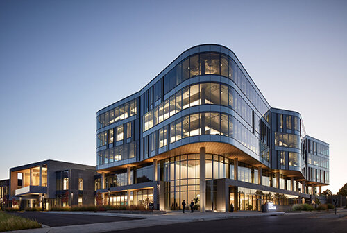
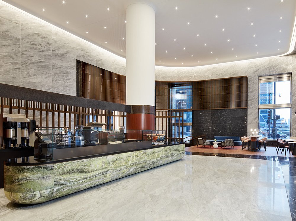
After more than a decade in Mill Valley, California, Glassdoor moved its global headquarters to an office tower in San Francisco’s South of Market Area to give its Bay Area employees a central location that better represented the firm’s fun, vibrant culture while embodying the city’s dynamic history and personality.
Tasked with shaping two floors of a 1960s-era 24-story International style high-rise, VDT’s architects, interior designers, and Media-Objectives studio collaborated to integrate architecture, furnishings, and graphics into a cohesive whole. An extensive research and data gathering process included shadowing employees, analyzing conference room occupancy data, and conducting surveys to identify what worked and what didn’t in the old headquarters and establish an ideal version of the workplace for the company.
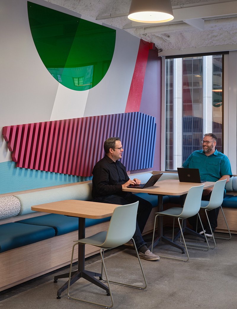
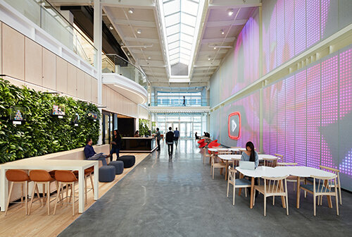
Aligning program areas with the column grid takes advantage of the building’s rigid orthogonality, a modular approach that ensures the most efficient use of space and provides for future flexibility. Interlocking circulation loops, custom-designed supergraphics on the walls and glass conference walls, and sharply distinct flooring materials help with wayfinding. Each floor has its own color and graphic theme as well.
Location
San Francisco, CA
Expertise
Interior Design, Experiential Design
Services
Branding, Signage + Wayfinding, Tenant Improvements
Select Press
San Francisco Chronicle
Photography
Christian Santiago
Partners
Media-Objectives
Allied
Cupertino Electric
Degenkolb
DPW
Golden Gate Fire Protection
HLB
Main Sequence
Neetek
Martin Sign Co.
Moss Inc
Skyline Construction
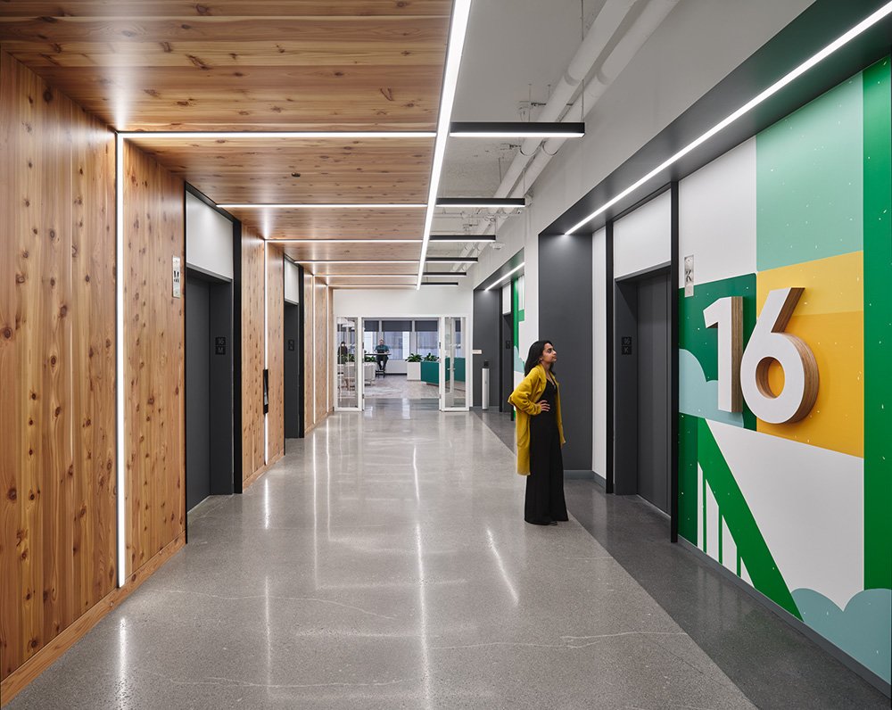
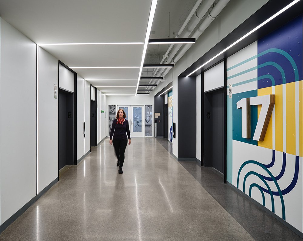
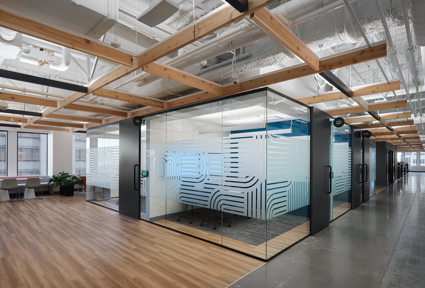
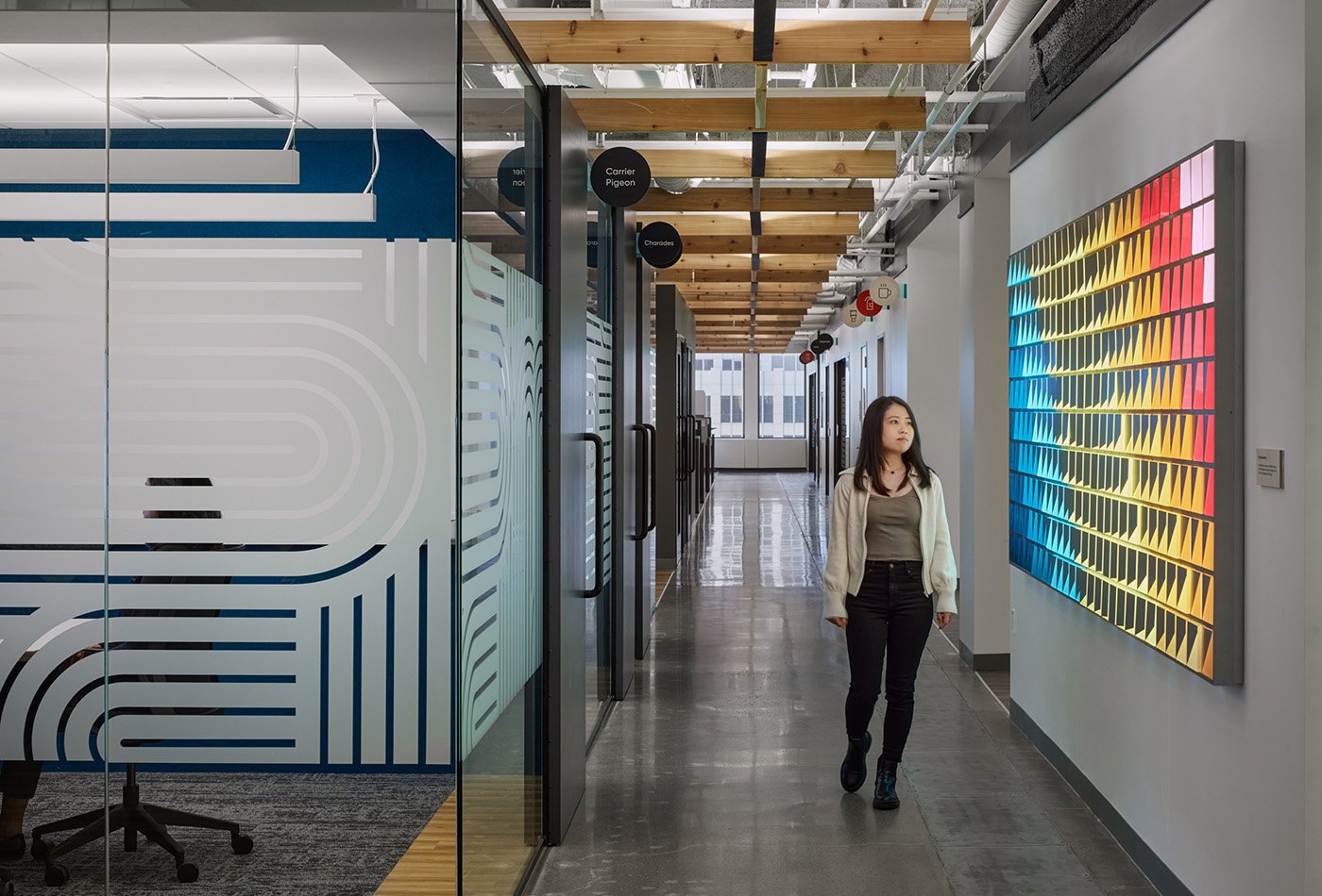
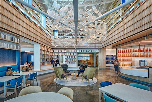
The first workplace VDTA designed for Glassdoor, in Chicago, relied on the company’s three main brand colors; this new office added teal. For San Francisco, the team opened up the palette to 15, referencing the city’s colorful personality and the headquarters’ role as a global hub for the firm. Wall graphics and abstract art installations express the company’s four core values—“transparency,” “innovation,” “good people,” and “grit.” Because Glassdoor greatly values its employee resource groups—internal advocacy organizations that work to grow equity and inclusion—the design team created an art installation that displays logos for each group, printed on wood.
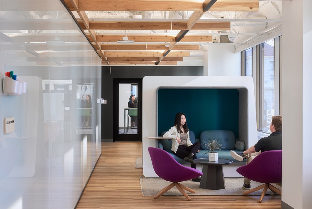
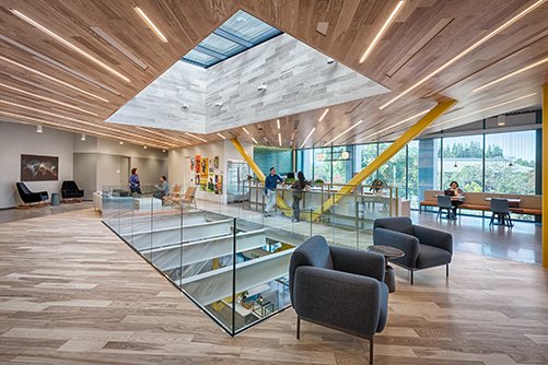
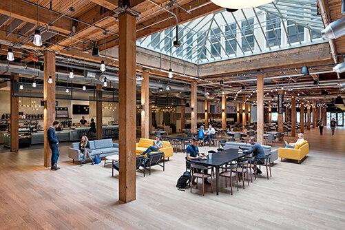
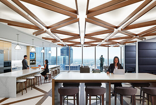
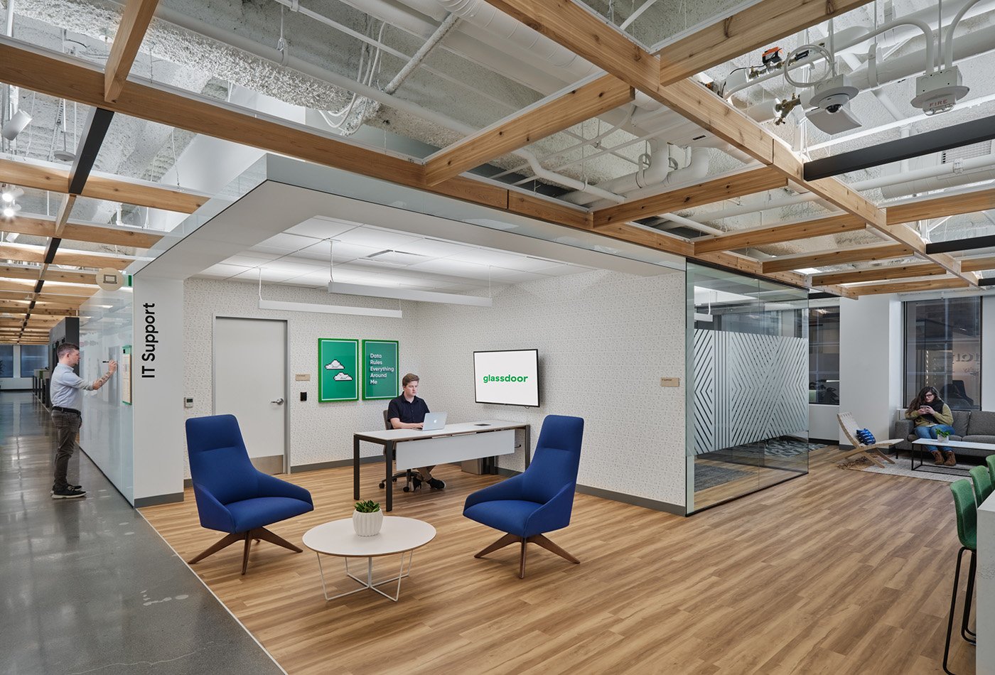
Throughout, the bright colors and graphics lend a sense of authenticity with their handmade feel, while natural materials humanize the rigidity of the International Style building. The use of exposed and painted wood joists in the ceiling recalls the wood trusses of the original Mill Valley space, reinforce the grid of the new building, and add warmth. In the entry zone, Glassdoor’s mission statement is spelled out in raised letters on the wall; long, linear light fixtures overhead align with the building grid, which also inspired the organization of the floor plan.
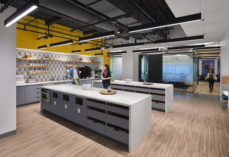
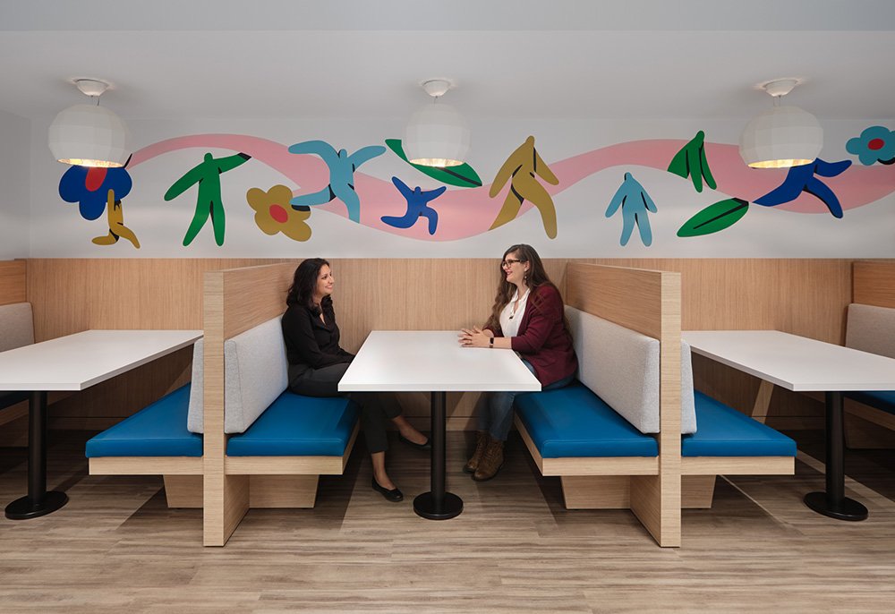
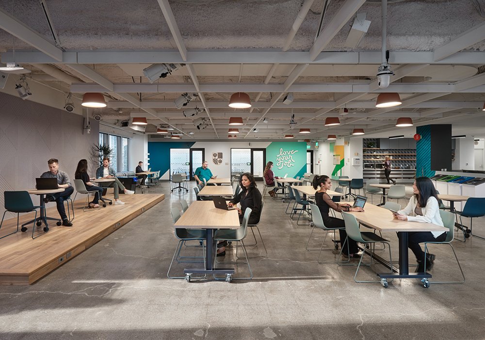
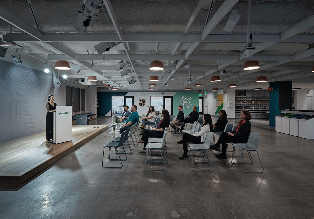
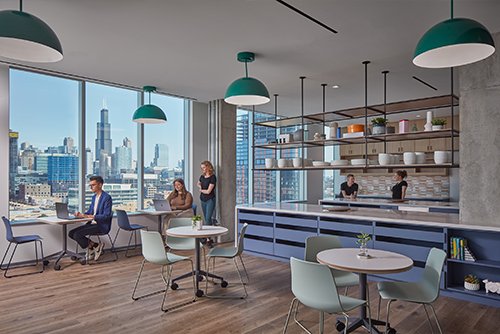
The headquarters includes meeting rooms, open offices, spaces for focused work as well as open collaboration, team huddle rooms, an all-hands area, a game room, and a kitchen. With the pandemic arriving halfway through construction, the team had to pivot to accommodate new workplace requirements, removing a row of desks in each quadrant and installing lockers. Employees no longer have assigned desks, but they do have assigned zones, so when they are in the office, they can keep a close connection to their manager.
Recognizing the importance of company culture to Glassdoor, spaces for socialization and fun were also a key component to the design. Hidden within a phone room adjacent to a central hallway, is a door disguised as a wall that leads to the office Speakeasy. This warmly lit, secret room with dark finishes and traditional tin ceiling tiles provides a small bar for the office, and a place where employees can disconnect from work and reconnect with each other.


