Tech Corners Campus
For this technology client's new campus in Sunnyvale, California our design team envisioned a series of spaces based on eight guiding principles:
a place that INSPIRES the growth of the COMMUNITY
a flexible landscape that says TOUCH ME, CHANGE ME
a surprising design, filled with the UNEXPECTED and UNCOMMON
an ECLECTIC place, transformed over time by employee INTERVENTIONS
a CAMPUS SIZE concept that is SCALABLE (from SM to XL)
an idea that has BIG BUZZ, but ECONOMICAL
ideas that improve systems PERFORMANCE
a place that is MEMORABLE
Central to the design process was the client’s commitment to creating work and social spaces that support employee health, enhance the workplace experience and improve overall sustainability. The scope of the project included a redesign of the existing campus’ outdoor spaces, as well as the interior renovation of five existing buildings. To create a cohesive campus experience, the design team developed overlying themes for each building, driven by organic patterns.
Location
Sunnyvale, CA
Expertise
Architecture, Interior Design, Experiential Design, Research, Master Planning, Sustainability
Other Services
Signage + Wayfinding, Tenant Improvements
Select Awards
LEED Gold + Platinum
Select Press
SEGD
Photography
David Wakely
Marco Zecchin
Partners
Media-Objectives
Devcon Construction Inc
Thornton Tomasetti
BKF Engineers
Outside Architecture
RDWI
Charles M. Salter Associates
Baefsky & Associates
Redwood Electric Group
United Mechanical
Castro Plumbing
The Marshall Associates
Level 10 Construction
Air Systems
Redwood Electrical Group
Outside Architecture
Horton Lees Brogden Lighting
Site
_
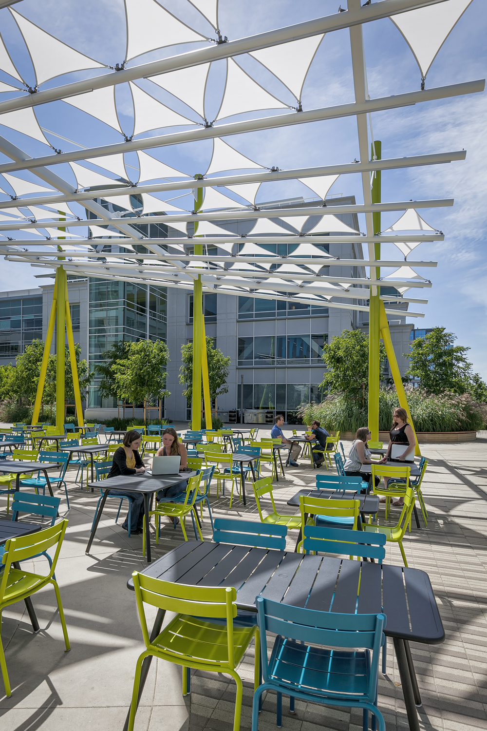
To create a sense of place, four main outdoor courtyards were integrated to the existing site, organized around the scale of the activities that dominate each one. The small courtyard is devoted to individual activities, the medium courtyard includes spaces for larger group meetings, the large courtyard includes a basketball court, and the xlarge courtyard includes the main outdoor dining area and shade canopy. Connecting these spaces are then paths that include secluded areas for individual study or relaxation.
The site is articulated by a series of colorful, vertical pole elements that scatter across the landscape and do everything from establish the campus threshold, support shading structures, and function as site lighting. The vertical pole elements define edges and hot spots, change color, orientation, and density to create unique spatial experiences with lyrical rhythm.
TC1 - Matrix
_
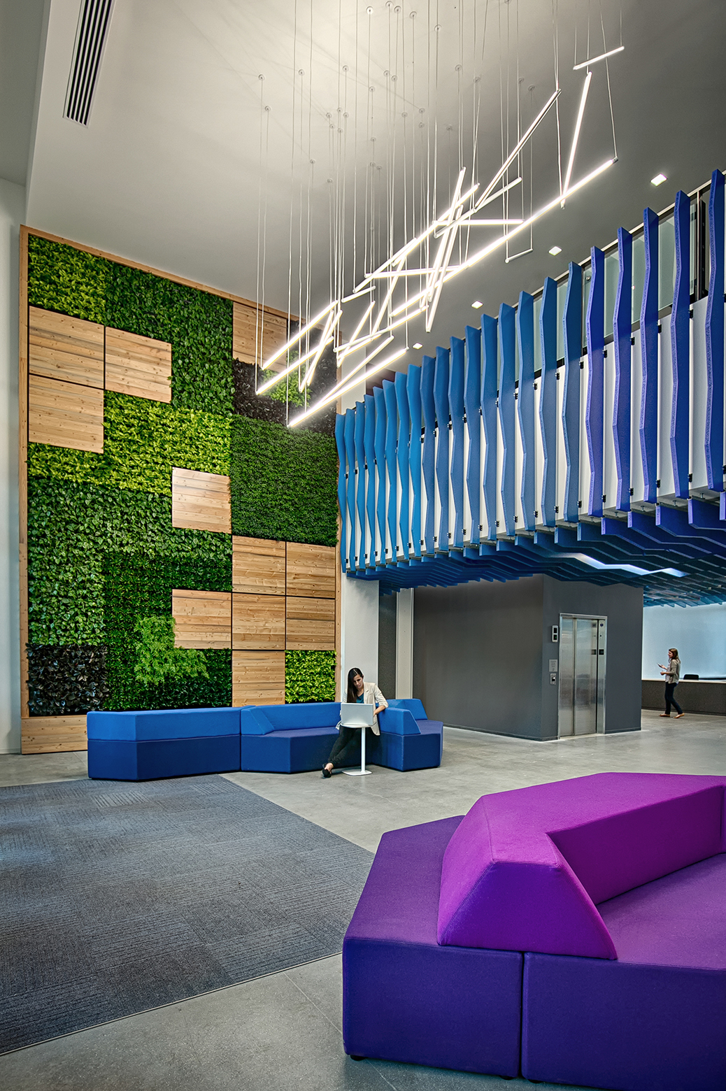
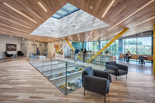
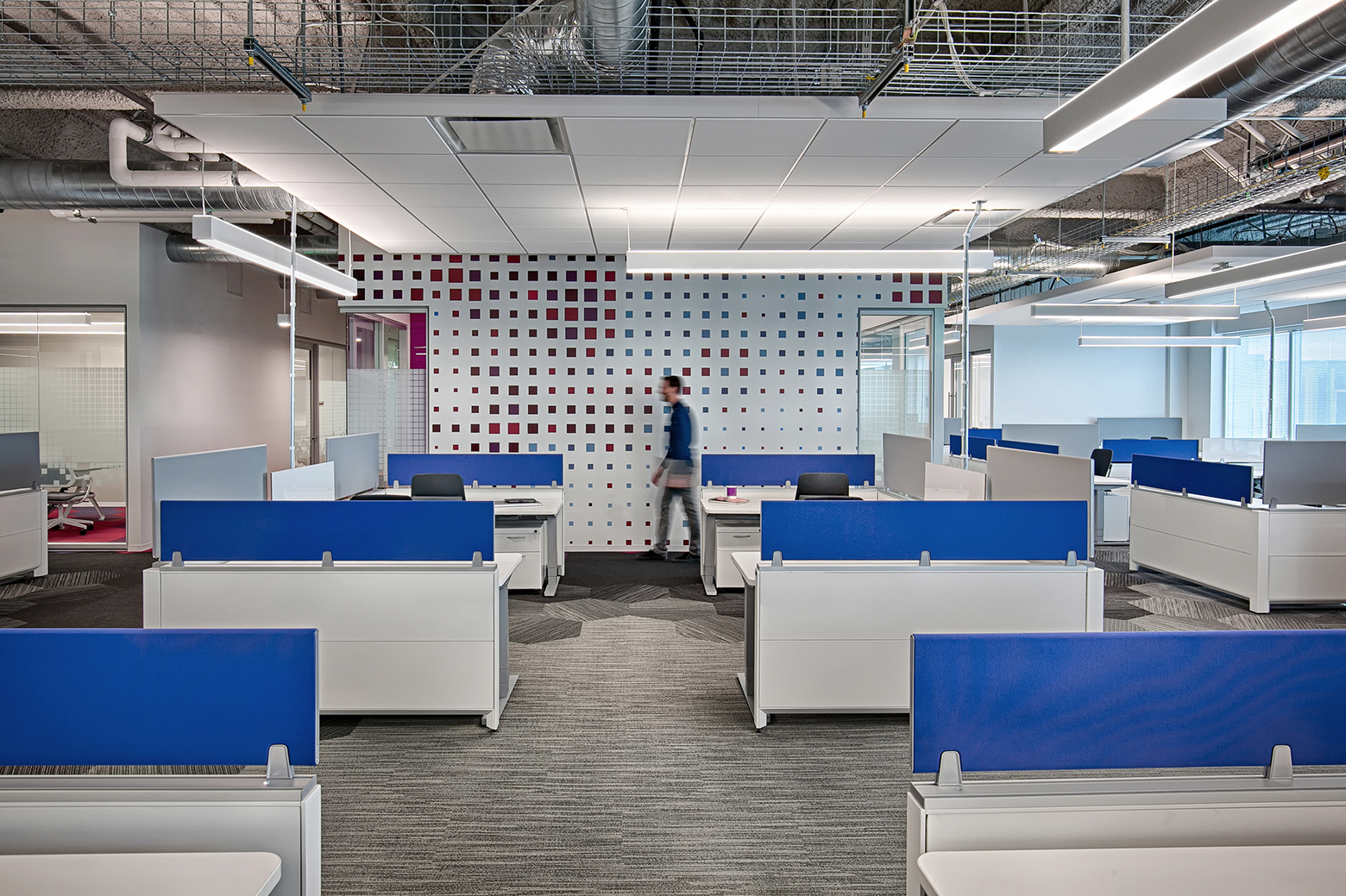
The overlying “MATRIX“ theme of TC1 is driven by organic patterns which ties the building together while providing a sense of identity. A swell of blue ceiling and wall fins, made of re-purposed wood doors from the building’s previous life as a generic corporate office wrap a mezzanine in the lobby and continue both north and south. The matrix of fins changes color as they disappear in the distance. This design re-occurs throughout the building in surprising configurations and colors, lending a binding architectural pattern for the Matrix building.
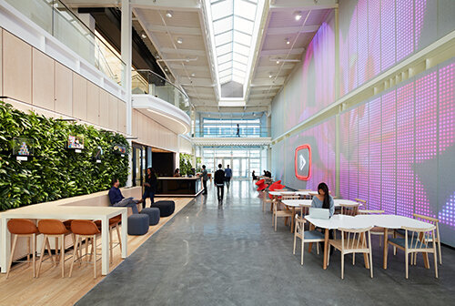
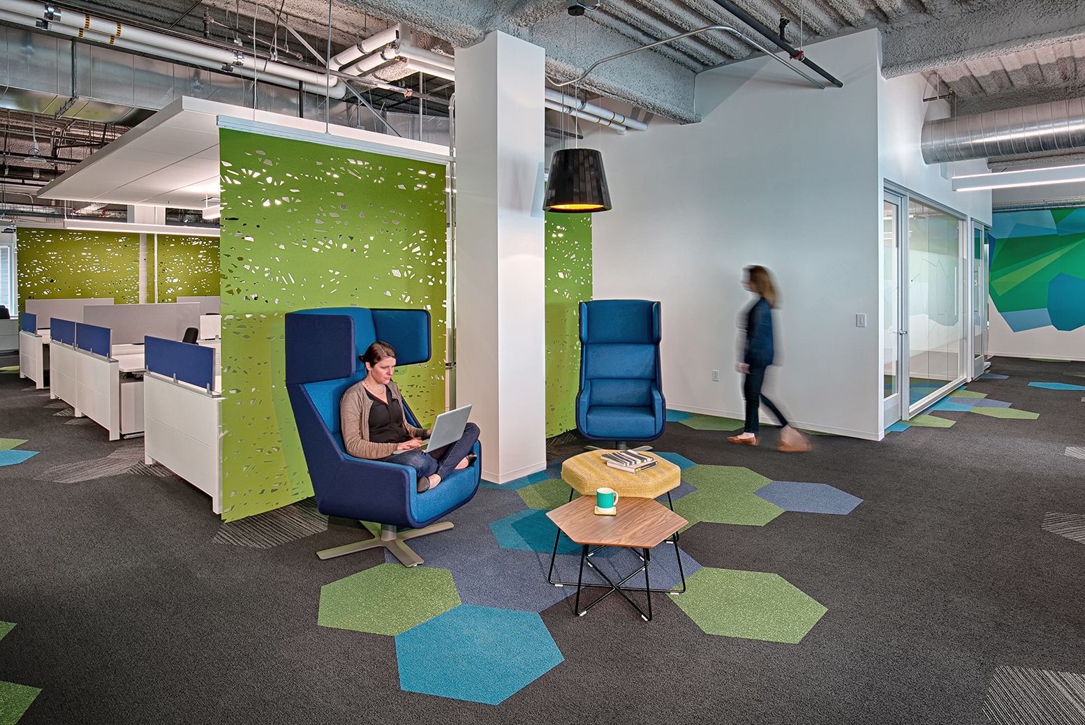
Beyond the biophilic green wall in the lobby is a broad expanse of linear space, an extension to the lobby. The space suggests community and collaboration with folding wood elements which offers seating areas, bar ledges, swing chairs, and more. Surrounding the open space is a techstop, laundry room, showers, satellite fitness center, bike repair and bike storage. On upper floors, an “activity concourse” connects amenity to conferencing and related office program. This configuration collects loud, active spaces together and buffers them from quieter work spaces beyond.
TC3 - Blur
_
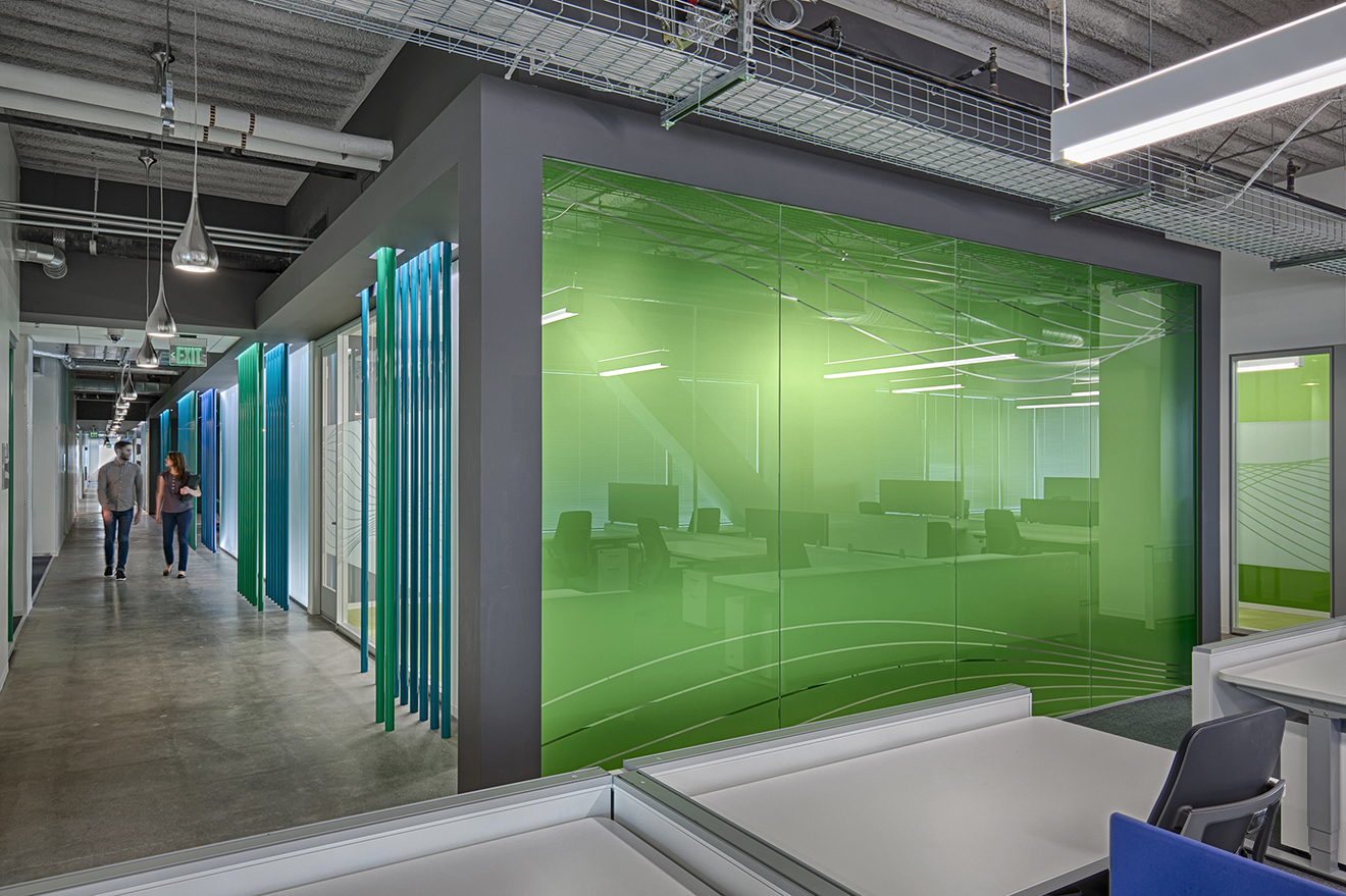
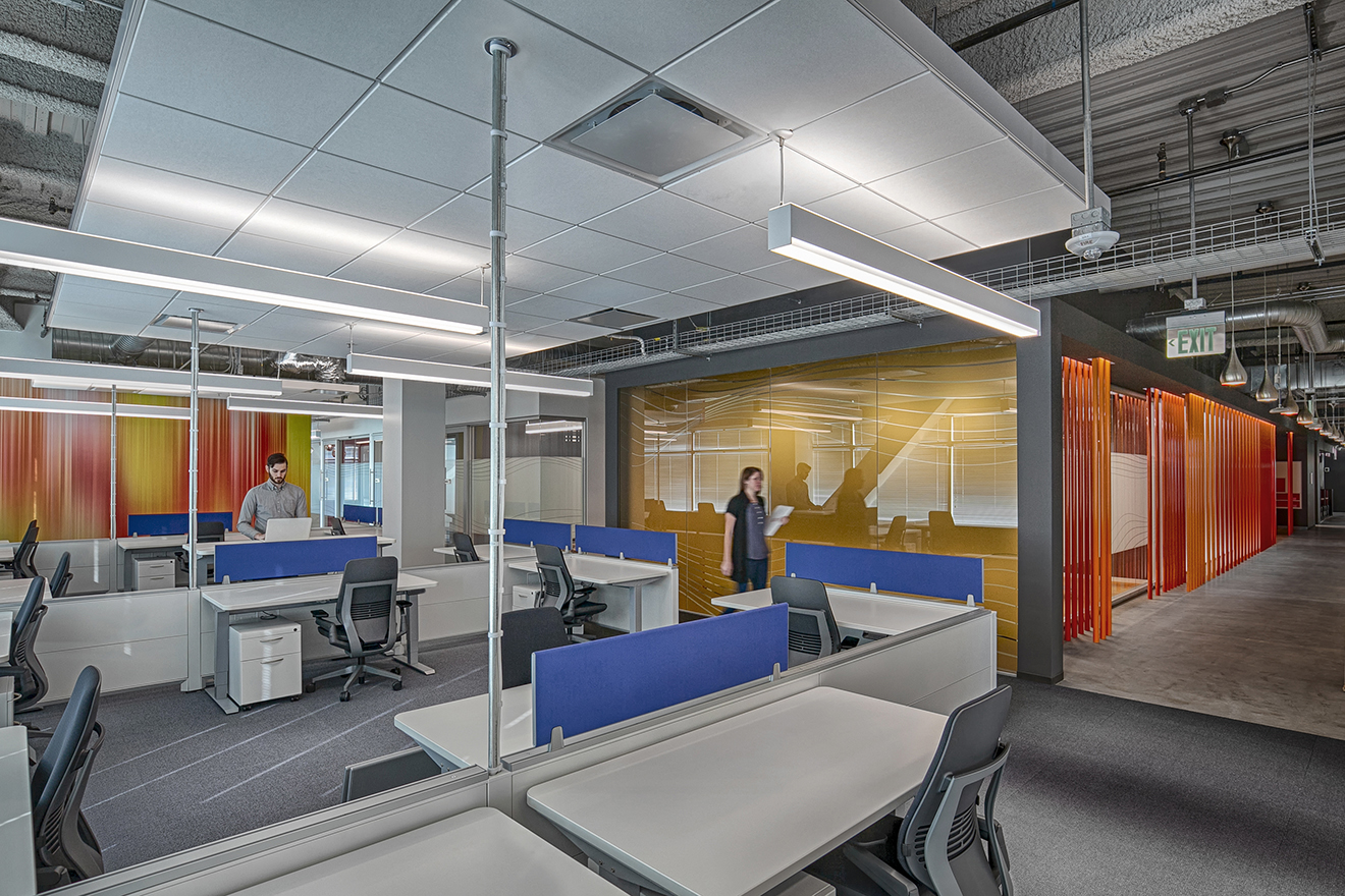
The overlying “BLUR“ theme of TC3 is driven by organic patterns which ties the building together while providing a sense of identity. High above the lobby, an undulating, ethereal installation of colorful aluminum poles drip from the ceiling like stalactites. LED lighting within each pole appears bright or dim, depending on the length of the pole creating a blurry and ambiguous effect.
North and south of the lobby are “activity concourses,” where the colorful stalactites become full height poles, reaching from ceiling to floor and functioning as a unique screen wall system for the building. Walking past a collection of collaborative booths and an informal lounge, the poles multiply as a second line of them appear creating an exciting blurring effect as one moves. A micro-kitchen, hydration stations, game rooms, various lounges and conferencing spaces line this “amenity concourse,” affording an exciting and collaborative center to the floor.
TC6 - Helix
_
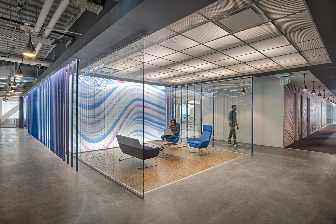
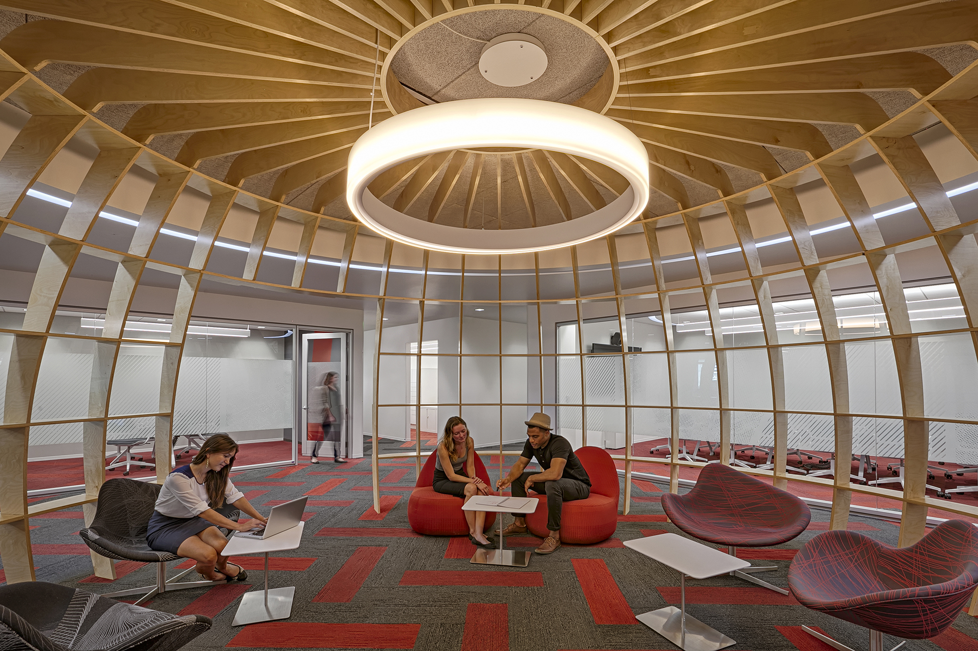
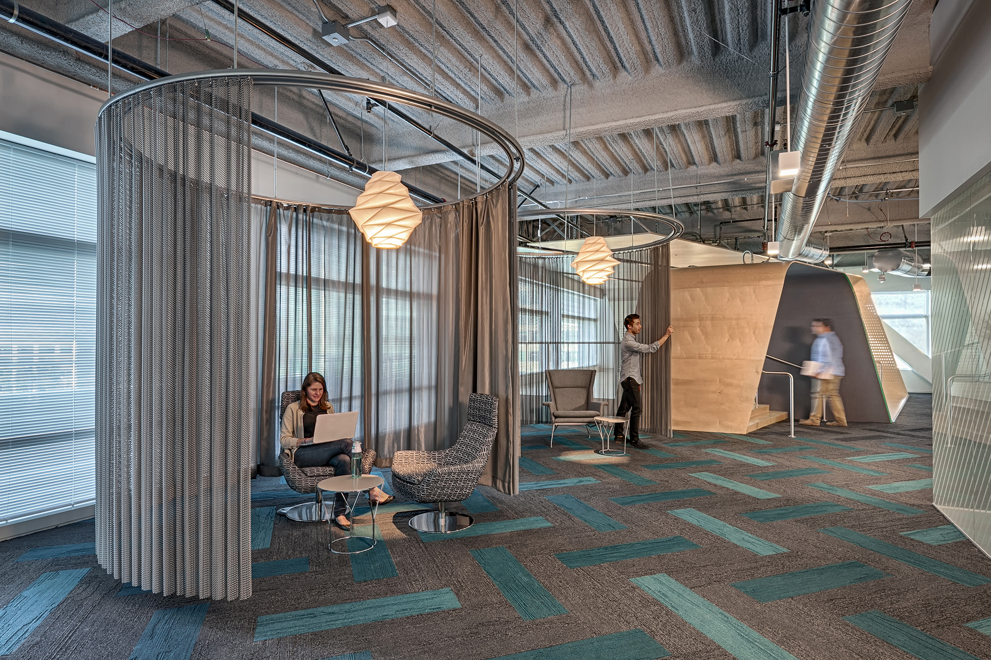
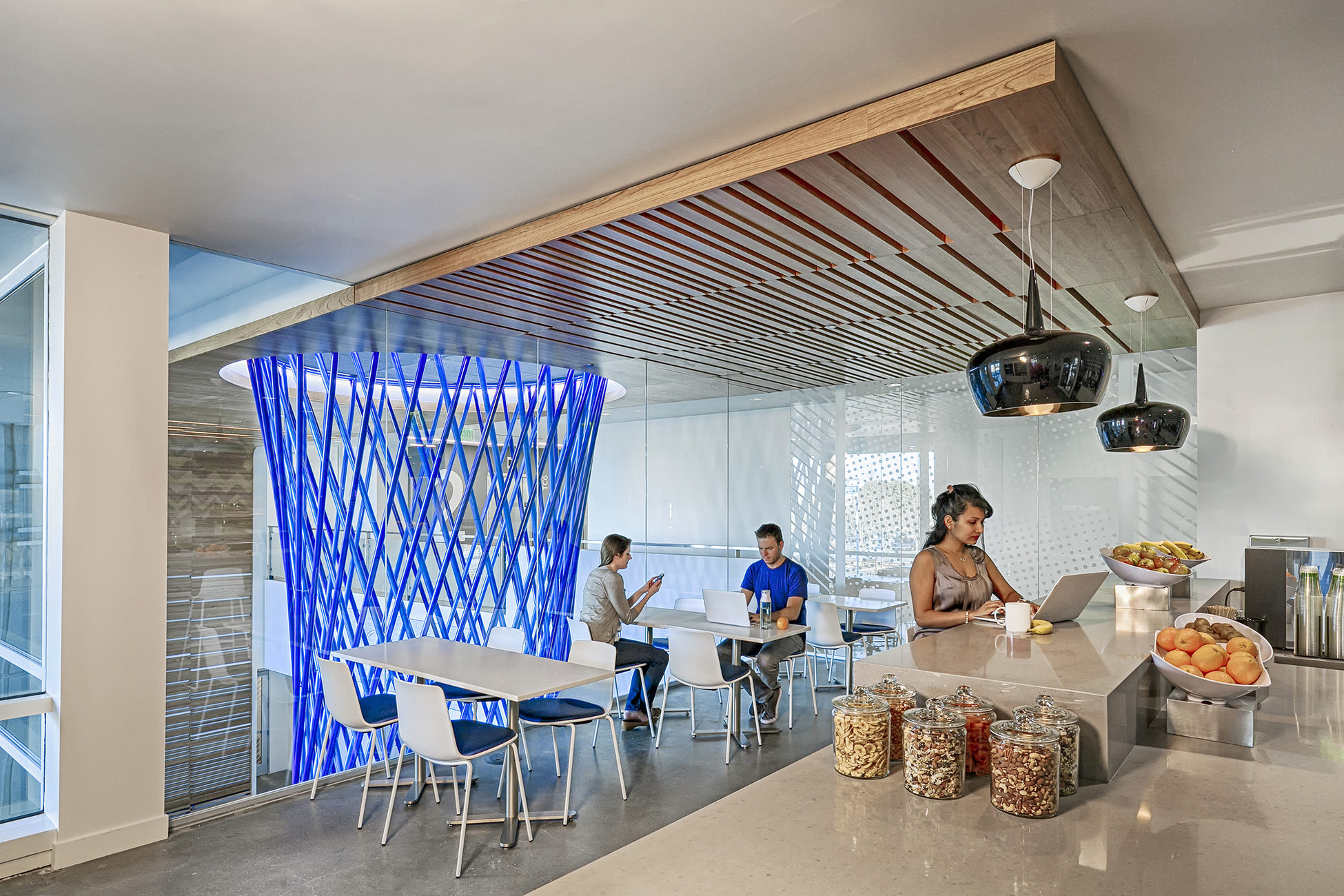
Stepping inside TC6, you are greeted by a two story woven aluminum tube structure. The sides of the form appear to curve, but this is the effect of the cylindrical strands, helically wound with biaxial braiding, reinforcing the building’s “HELIX” theme. Walking down the primary circulation corridors you sense the coil of the helix tightening at opaque areas and unfurling at open areas. The helix appears to be made of an impossibly thin bent plywood shell, lined with a soft, acoustic felt interior, and accented by a bright paint colors. The plan diagram moves diagonally across the floor plate with a series of linked courts and serendipitous paths. This organization generates surprise views and unexpected spaces, including a rhythm of bright, sunlit, outward-looking zones, as well as moody, framed, inward-looking courts.
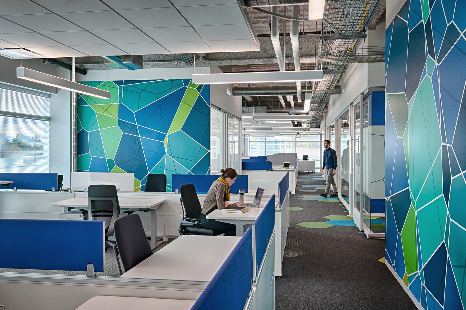
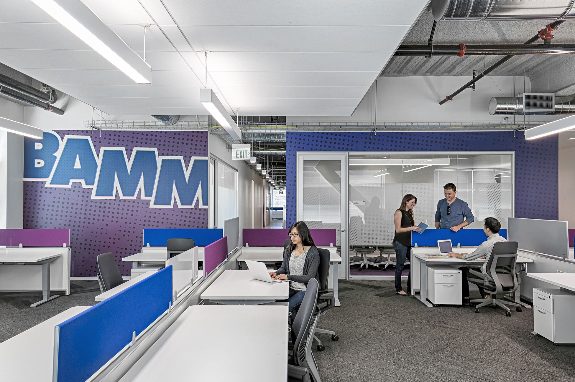
Throughout the Tech Corners design process we viewed furniture, finishes, and environmental graphics as integral architectural elements and designed the space with a seamless approach. Each floor has a distinct color gradient, which ties into the architectural elements finishes and becomes a wayfinding element. Glass privacy film and wall graphics are uniquely tailored to the building’s themes.
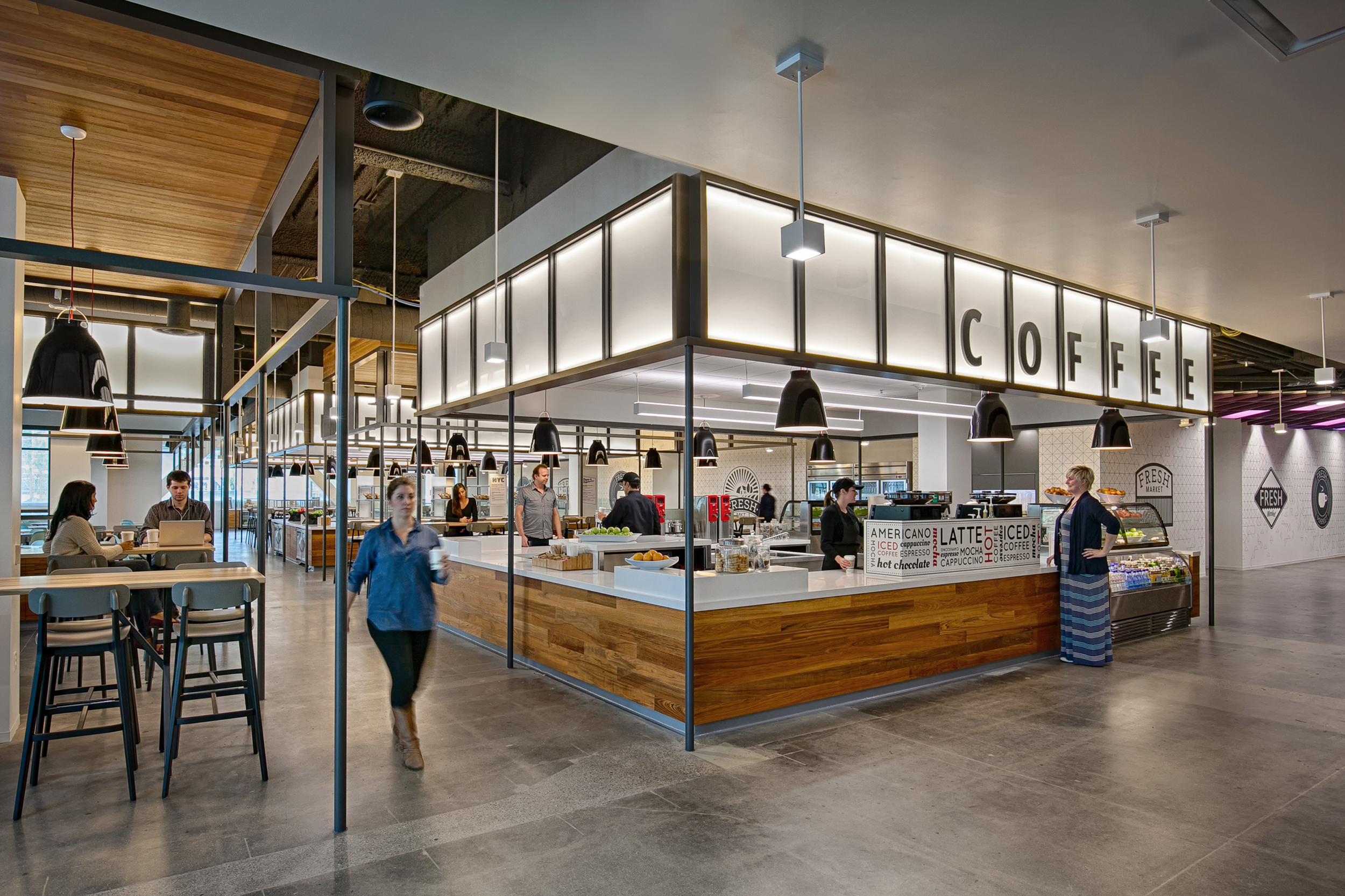
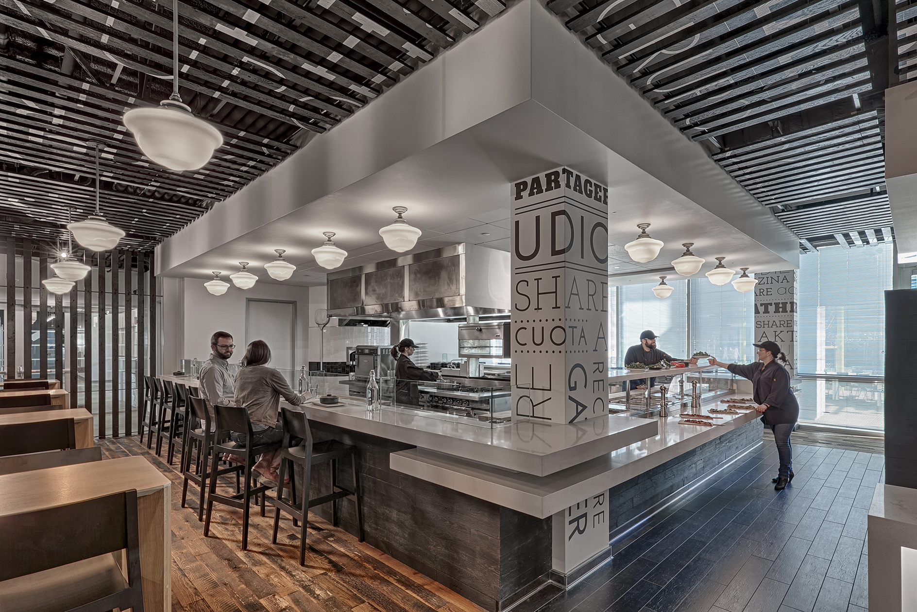
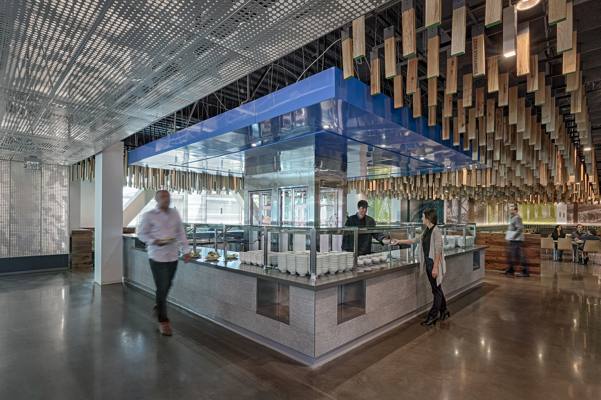
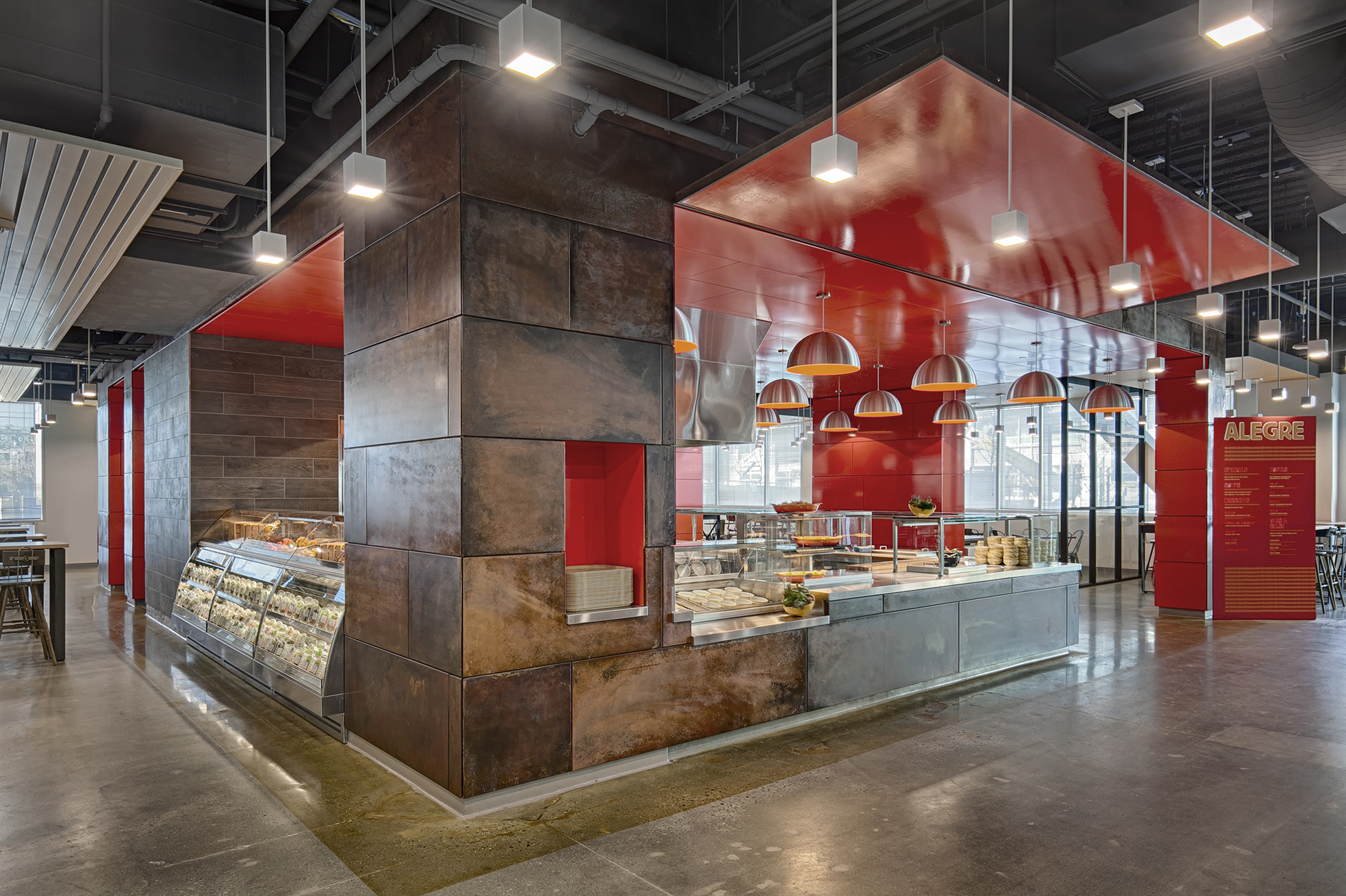
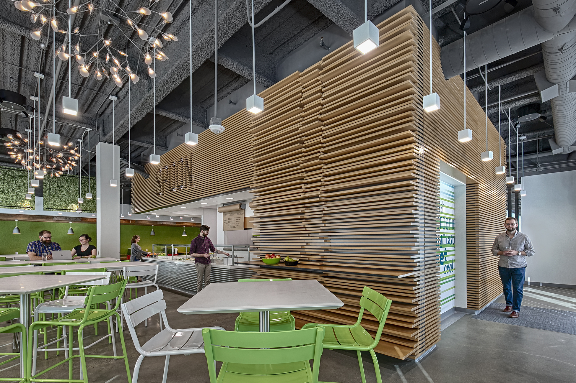
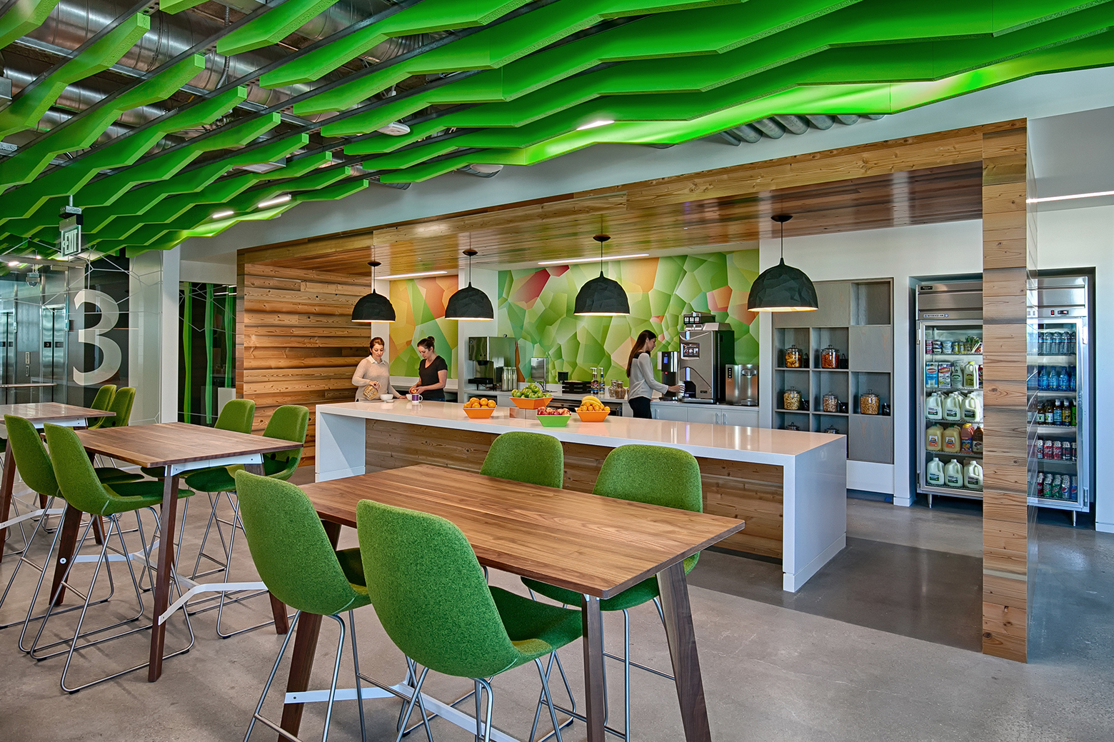
Cafes
_
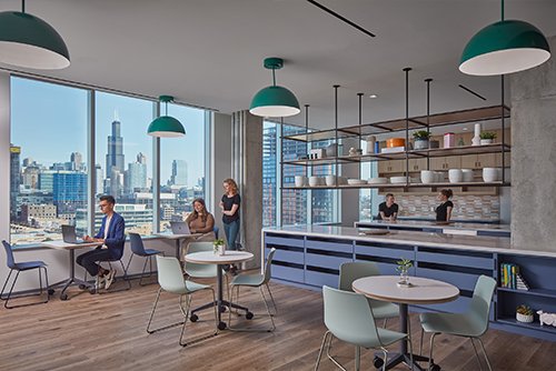
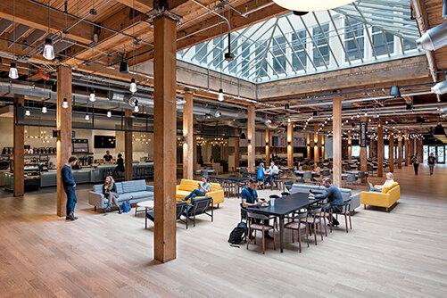
A series of café spaces within the first floor of TC1, TC4 and TC6 were developed, each with its own unique character and menu, providing diverse dining options for employees. Options include an Fresh Market, All-American burger joint, a healthy juice and salad bar, a Vietnamese pho restaurant, a Latin restaurant and a plated family style Mediterranean restaurant ensure an abundance of distinct experiences for dining. Booths, tables, high tops and bar seating are distributed throughout each café providing a variety of seating options for every employee’s preference while fostering the environments as a collaboration space. Café identities, menus and environmental graphics were designed for each space alongside the architecture to best enhance the ordering process and complete the overall ambiance of each cafe.
